Ralph Lauren February Display in Paris
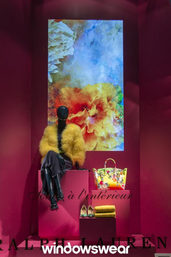
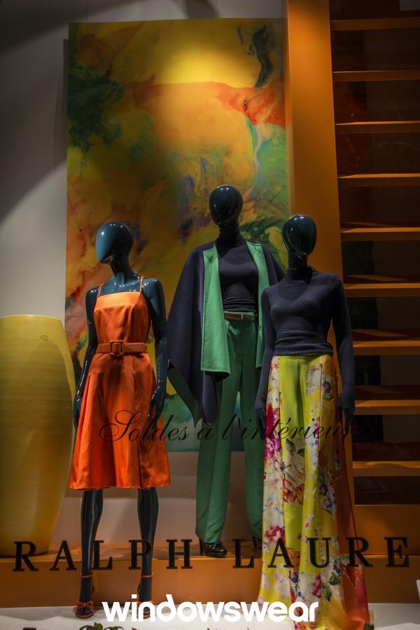
Ralph Lauren’s February display is very pleasing to the eye! It is an excellent example of using basic design elements and tools to create an appealing window display. My eyes were first drawn to the artwork on the canvases, and then I began to notice all the exquisite merchandise. This is an excellent example of using size as a strategy to draw attention and focus on the display. The company used color as a communication tool to automatically makes us think of the coming of the Spring season by combining a variety of bright colors with high intensity. The different fabric and textures displayed makes the viewer wonder what the merchandise might feel like if touched which can draw customers into the store. All of the design elements combined in this display creates unity. The display is staying consistent with Ralph Lauren’s overall mission of being innovative and maintaining high standards in terms of the quality of their product.
Hermes February Display in Paris
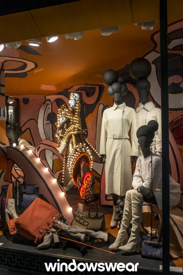
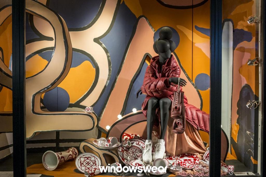
The Hermes February Display has multiple unique details presented and gives its viewers a lot to look at. But, it appears to be a bit too cluttered. There is a lot of tension created in this display by scrambling merchandise on the floor in a random order and making objects appear to be sideways or upside down. This causes the viewer to wonder if opposing forces will disturb the balance of the items. Creating tension can be a good thing and makes the customers question the display. This makes them want to look at it for a longer period of time. Hermes is best known for their wonderful tableware and accessories. However, they may have overcrowded the display with too much merchandise to look at which can cause the viewer to become overwhelmed. It feels unbalanced and does not create visual unity. It is hard to tell exactly what is being emphasized in this display. I believe Hermes tried to use surprise as a merchandising strategy here, which is something that is super hard to use effectively. The display definitely has that “traffic stopping” effect by creating a lot of tension for its viewers in the way they have chosen to emphasize their products. It was certainly an unexpected display, and one that I won’t forget. Though, improvements could have been made to declutter the merchandise to create a more unified display.
