Featured

“Building My Brand Identity”

Annual Illinois State Fashion Show 2019
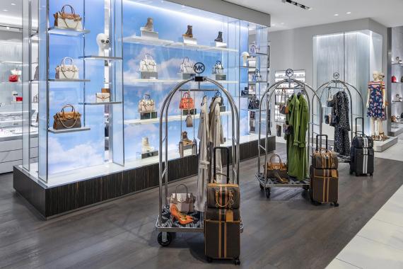
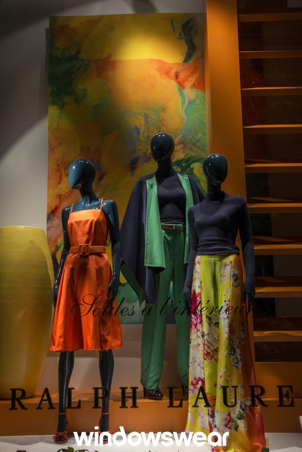
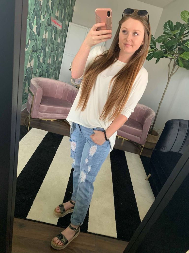
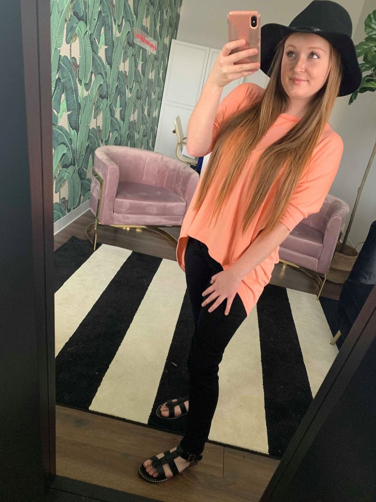
Academic Background and Career Experience

I am a senior at Illinois State University, where I am working toward a bachelors degree in Fashion Design and Merchandising with a minor in Business Administration. On top of being a full time student, I have gained a lot of retail experience by working for many different outlet stores since I was sixteen years old. I have also taken on multiple internships over my summer breaks. Last summer, I interned for an online clothing boutique called Royal and Reese as a social media specialist. Through my involvement with work and my education, I have developed skills including; product knowledge, interpersonal communication, attention to detail, and much more!

Strengths and Achievements

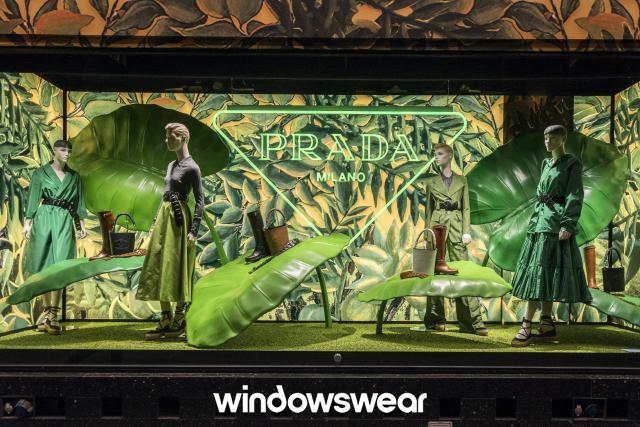
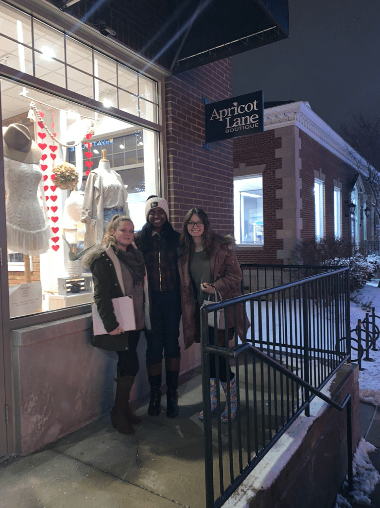
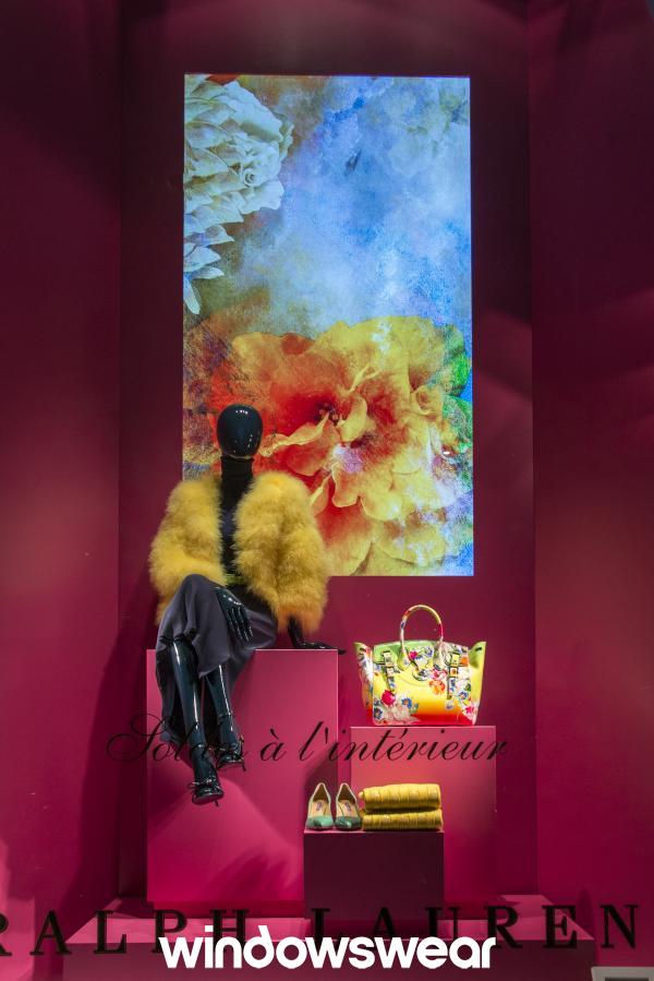
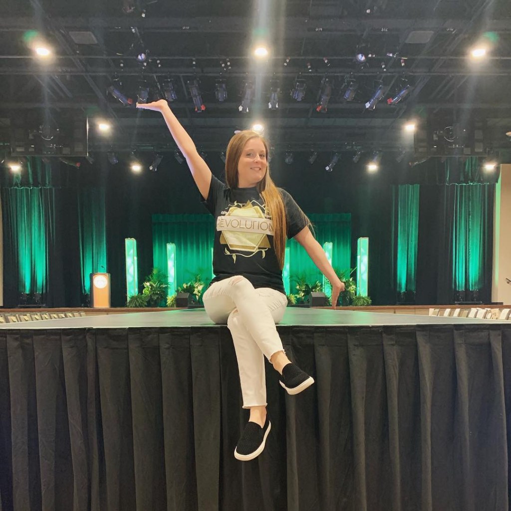
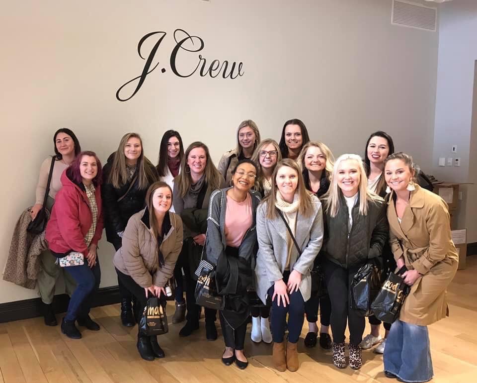
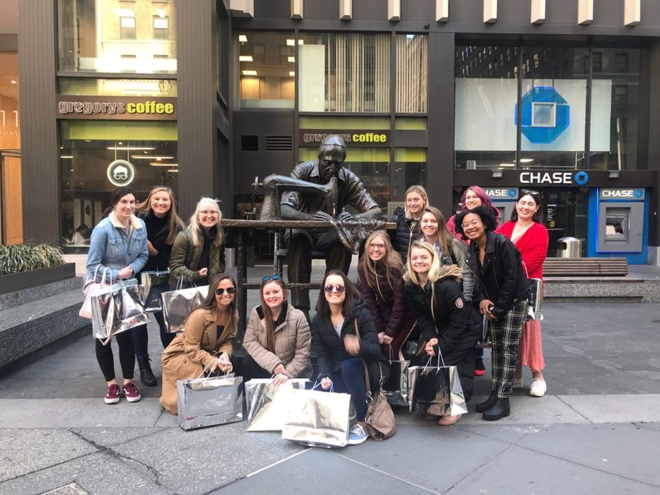
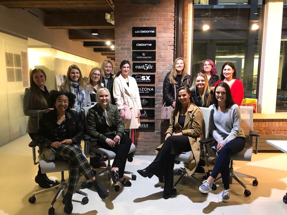
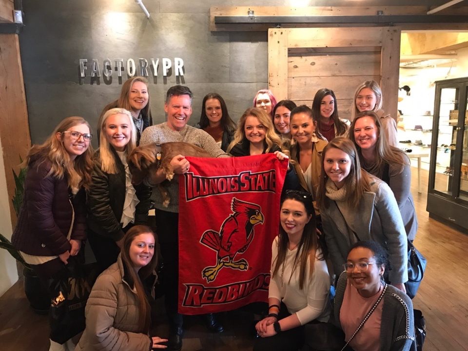
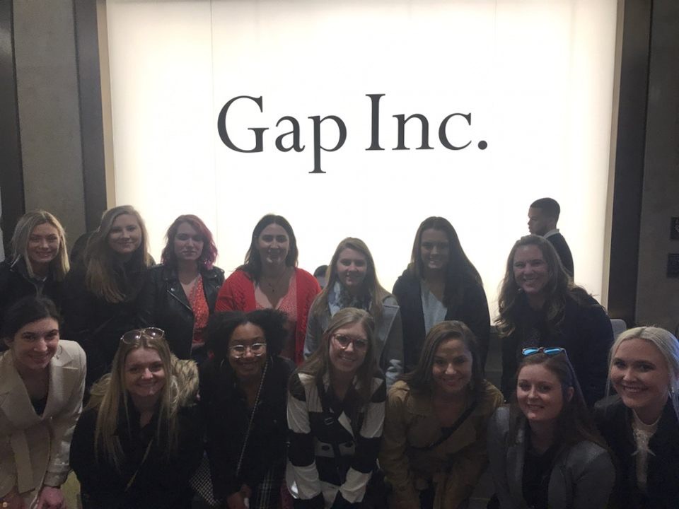
I have always had an eye for fashion since I was a little girl. Both of my grandmothers worked in visual art and design for the industry and I consider them my role models. It’s safe to say that fashion is in my blood! I have gained many strengths and achievements while studying fashion at the university. In the past year, I have taken on multiple roles including; Marketing Director for the ISU Fashion Show, Family and Consumer Sciences Student Ambassador, Teaching Assistant for Fashion Trend and Industry Analysis, and Sustainability Intern. Last spring, I was able to attend a fashion study trip to New York where I visited multiple corporate offices. This study trip enriched my knowledge of all the opportunities that there are to take advantage of in the retail industry and gave me a chance to learn from and be inspired by experts in the field. Throughout my college career I have learned that my greatest strengths are, but not limited to: being a competitive spirit, having strong visualization skills, paying attention to detail, and working effectively with others. Possessing these strengths will help me achieve my goals!

Career Goals

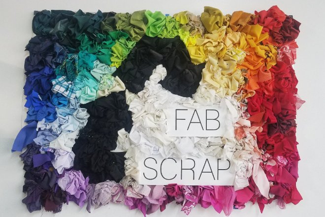
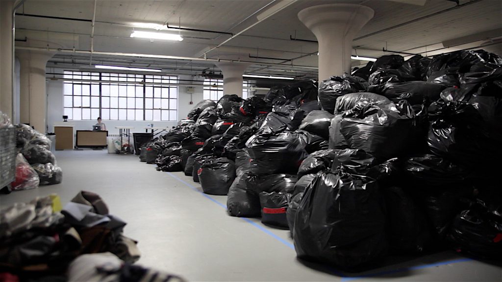
My main career goal is to be heavily involved in the sustainable aspect of the fashion industry. Apparel manufacturing is the second most polluting industry in the world, and it is my responsibility to be a part of making a difference! I dream of creating my own earth conscious brand one day. It is important to me that I work for a company that cares about the impression that they make on not only their customers, but the imprint that they make on our earth as well. It is my destiny to incorporate sustainability into my personal and professional life in every way possible. I plan to achieve this through; continuous research, sharing my knowledge, and maintaining health and well-being of myself and others.

Visual Merchandising Analysis 10: Good/Bad

Burberry

Burberry uses tension to create a fun atmosphere in this display window by making the mannequin appear to be floating by hanging onto balloons. Viewers may feel tension and wonder if opposing forces will disturb the stability of the display. The proportions and size of the balloons alters the size of the merchandise and the mannequin to appear lightweight which changes the optical weight of the objects and is a unique design element to use when creating displays. Burberry did a wonderful job using key design tools an elements to create a visually pleasing display!

Dior

Dior is known for their luxury garments and immaculate window displays. However, I feel as if this display is a bit too overcrowded by the greenery in the background. The mannequins that are modeling the merchandise are too hidden by the plants that droop down over their faces. It is also visually displeasing to see that the styles and garments being displayed do not go well together. I cannot determine what theme Dior was going for here because they mixed business, casual, and dressy outfits all together. The garments and the setting do not create a unified display as a whole which means consumers may not find harmony within this display when they view it.

Visual Merchandising Analysis 9: Good/Bad Mannequins

Louis Vuitton Display for SS19 Collection

shssh

Louis Vuitton creates the use of mannequins that we could consider beyond our world domain with an interstellar traveler look. The idea here was to create alien-like mannequins that look like they came to earth to see the sites and only the best LV travel accessories could accompany the mission. The new accessories are displayed with tension and causes the viewers to wonder but has such a positive effect. I absolutely love the innovation created in this display of merchandise on abstract mannequins.

Zara Mannequins in Window Display

Zara’s display represents neutral colors, business comfort style, and a classy etiquette type of mood. At first glance, I think it is very pleasing to the eye. I enjoy how soft it is on the use of color, it is not something you see often. When I take a look at the motion and positioning of the mannequins, the mannequin on the left seems in a bit of an awkward position. I feel it might look better if there was no change in the position of the models and they all remained the same. I think it would balance out the display to give it a more aesthetically pleasing image.

Visual Merchandising Analysis 8: Good/Bad

Micael Kors Display

Michael Kors February display in London symbolizes the luxury of travel and accessories. The window display is set to be on an airplane with a gorgeous view of the sky and what is better than traveling to somewhere new with your favorite handbag?! The display comes together as a unified whole all around and even the interior of the store goes with the theme of traveling by adding a cloud backdrop near the accessories and luggage carts to display merchandise. I absolutely love this layout and would be intrigued to purchase a new item for travel after being drawn in to the store. This display is truly inspirational and shows that the options are endless when it comes to creating a window display and floor layout.

Burberry Display

I found this Burberry display to be a bit displeasing because it is lacking a theme and causes a bit of negative tension. The first thing that I noticed when viewing this display is the monkeys and I could not pin point why they were there because there was nothing else around them to represent a theme. The monkeys are bigger than the accessories being displayed which I feel is taking attention away from what is being sold. The garments displayed on the mannequin look very trendy and slick, but I am afraid the merchandise is being underrepresented in this display because there is not a lot of design elements used to catch the viewers eye.

Visual Merchandising Analysis 7: Good/Bad

Jo Malone March Display 2020

Jo Malone launches new fragrance in London and their window display is beaming with Neon, technology, and beauty! This window display includes proper communication through signage before even entering the store. This bright and attractive sign draws attention to customers and reveals the new lavender scented fragrance. This display communicates Jo Malone’s upscale brand image by using digital screens to display merchandise, neon lighting for signage, savvy gift boxes for packaging, and a huge lavender cloud to bring it all together. The tone-of-voice in the signage is very polite as the company chose to use a lowercase and elegant font making it easy for customers to read the message. Overall this display is wonderful and Jo Malone really knows how to present signage effectively in their window displays!

Penhaligon’s March Display 2020

Penhaligon’s is an upscale fragrance and beauty shop and their March display focuses on signage and has a simplistic design with few items being displayed in the window. Personally, I was not visually pleased by their signage in this display. The color of the wording does not seem to go with the store atmosphere. It is quite confusing to see three different colors used for front all in one place as well. Additionally, there are multiple types of fonts used all in one spot . It is important to stay consistent when creating signage, especially for a window display that can be viewed from outside of the shop. With consistent font color and wording, it can be less confusing to interpret the overall message of the sign. I would like to compliment Penahaligon’s on using William P’s handwritten name printed on the window as a signature. This is where a change in font would be more acceptable. By using William’s handwritten name in print, it communicates a tone of exclusivity and convinces the customer that the merchandise is unique to the company and their customers too.

Visual Merchandising Analysis 6: Good/Bad

Dior March Display in New York

The Dior display for March is absolutely stunning! From top to bottom, there are multiple design elements that were used here to create an aesthetically pleasing whole. They used the perfect combination of texture and lighting to enhance the merchandise. The sleek, textured, and soft surface creates textural congruity throughout the display. Viewers must wonder what the merchandise feels like and would most likely be drawn in to get a real feel for themselves because the display is so convincing. The use of repetition of pattern in the background and garments creates a special sense of visual rhythm. The use of rhythm in window displays can provide unity and create familiarity and is a great merchandising strategy!

Eilen Fisher March Display in New York

Eilen Fisher’s March window display portrays earth conscious apparel with its simplicity in design. The window has a statement that says “Tencel is made from responsibly harvested trees, so no ancient or endangered forests are cut down for the sake of clothes”. That is wonderful knowledge to be provided to viewers of this window and is a great way to get consumers to enter the store and buy the garments made of ethically sourced fabric fibers. However, I feel this statement should have been printed in white so that it is more noticeable from a distance. It was hard for me to see what the window said as I was viewing this image. That quote should be the focal point of the entire display because it is crucial to the entire design of this window. Overall, this display has a lot of great potential and I love the message that it is sharing with viewers. It is pleasing to see a display represent more casual, simple, and chic garments. Not something you see too often in a main window display.

Visual Merchandising Analysis 5: Good/Bad

Bloomingdales February Display

Bloomingdales February display is clearly inspired by Valentines Day and is encouraging consumers to go in and buy sexy and elegant lingerie for their special someone. I really enjoy the use of spotlight lighting in this display. It really brings out the bright and cheery colors on the models and allows the viewer to focus on the merchandise. Bloomingdales used color as a primary design element by using different tints and shades of red combined to create an aesthetically pleasing ensemble. The texture of the lingerie makes me want to walk right into the store and get a feel of the merchandise myself! The direction and sequence of the models are placed in a way where you can easily view the items in a presented order. I love how the models seem to be in motion and show movement, it makes the display feel more realistic. This is an outstanding display!

Gucci February Display

As a fashion professional, and from my perspective, Gucci’s February display shows graceful and elegant spring outerwear merchandise and is put together in a unique way. However, a typical consumer may not appreciate or fully understand the set up of this display which may result in some confusion and negative reviews. Gucci used positive and negative space which is a very hard design element to achieve successfully. Some viewers may feel as if there is not enough being displayed in the first image above and may be expecting more in a display from this luxury brand. However, I am here to teach you that Gucci did this on purpose. They purposely created a tension of imbalance in this window to make viewers wonder about they layout of the display which leaves more of a memorable impression. I would have liked for Gucci to exclude the gated window fencing in image two because it is taking away the ability to be able to view construction details of the garments. It would be more visually pleasing had the whole window been visible like the left side of the image. Gucci’s February display did exactly what it wanted to do to it’s viewers which was to create tension so that we could wonder why it is that way.

Visual Merchandising Analysis 3: California

Nordstrom Spring Display in Los Angeles

Nordstrom’s Spring display is sporty and exhibits adorable activewear ensembles! However, some improvements could have been made to enhance this window display by making it more pleasing to its viewers. There is almost no use of color, making the display very neutral. This is not always a bad thing, but the outfits being displayed are almost the same color as the walls and the floor which causes too much blending. It is my personal opinion that adding more color to the merchandise or the background would make this display more attractive. Consumers may pass this display by without taking a longer look at it because it is bland in the use of color which is a very important factor in a window display. After noticing that the props hung from the ceiling are birdies used in the sport of badminton, I realized that this window was not only about being sporty, but it is encouraging viewers to buy activewear that they can feel comfortable and confident in. Though, I am a tad bit thrown off by the mannequins wearing high heels . I feel as if it would be more appropriate for active shoes to be displayed here. In California, activewear in a regular every day attire for many residents and people often mix it with non activewear. This could be why Nordstrom chose to pair the heeled booties with active clothing. I am from Illinois, which is why I perceived this display differently than residents of California may have. All in all, this is a unique display that could use some minor improvements.

The Butterfly Effect in Los Angeles

When you first view The Butterfly Effect window display, you can instantly tell that it is portraying a theme of “The Art of Fashion”. The use of surrealism art (a movement that started in the 20th century) causes tension within this display and releases the creative potential of the unconscious mind. This is a goddess that is being revealed by butterflies from time and space and is embarking on a new journey in life. The clock and door is giving hint to that message being portrayed. The overall unity and balance of this display ties together beautifully. This display is absolutely exquisite in every aspect. I can’t pin point a single improvement that I would have made. I would have to score this display a 10/10!

Visual Merchandising Analysis 2: New York

Prada February Display in New York

Prada created an aesthetically pleasing display that gives customers a Spring and sustainable vibe! Notice how there are multiple different types of items being displayed to encourage customers to buy a set of items instead of just one. This is a genius skill to use when marketing products because it makes customers want to buy multiple items at a time. Prada used color, texture and tension as tools in this display. The color green throughout the window display creates a fresh and sustainable feel and appeals well to the viewers eyes. There is some texture and tension created with the use of giant leaves as they appear to be tilted but are still able to support the accessories that they are holding. Overall, this display highlights their products very well and and it all comes together to create a unified whole!

Moschino February Display in New York

It appears as if Moschino was attempting to create a sustainable display with the use of natural looking materials. Sustainability has been a popular topic and has become a concern for consumers when they purchase products. Customers are starting to care about what fibers are used to make their clothing and whether they were ethically made or not. It is smart for companies to voice that they care about the impact that they make on the environment through displays. However, this window appears to be incomplete and unbalanced. The backdrop looks like it is unstable and hidden from all of the other merchandise which creates tension, but not in a visually pleasing way. It seems as if the backdrop may topple over at any moment which causes viewers to be nervous or uncomfortable while viewing the display. This type of tension may distract the customer from viewing the merchandise that is being presented to them. Their clothing looks very fun and savvy, but it is hard to notice that aspect with everything else that is going on in this window. It would be nice if there was more of a sequence in which items are presented for viewing to consumers. I would recommend Moschino to decrease the amount of props used in their display and to space everything out more to create a unified whole.

Apricot Lane Store Visit

Fashion Promotion Choice Presentation Project: Alicia, Jada, & Paige

I had the pleasure of visiting Apricot Lane in Uptown Normal, Illinois to practice visual merchandising analysis by using my knowledge learned in my Fashion Promotion course at Illinois State. The purpose of the project was to analyze all of Apricot Lane’s store features which included looking at their displays, lighting, graphics, layout, and atmosphere. My group and I were very pleased with our store visit and absolutely love the look of this boutique. All of their store features come together to create a wonderful shopping experience. Overall, the store layout and special features compliment their brand image very well! This is one of my favorite boutiques to visit near campus. I had so much fun conducting this project with my group members and look forward to visiting Apricot Lane again soon.

Visual Merchandising Analysis 1: Paris

Ralph Lauren February Display in Paris

Ralph Lauren’s February display is very pleasing to the eye! It is an excellent example of using basic design elements and tools to create an appealing window display. My eyes were first drawn to the artwork on the canvases, and then I began to notice all the exquisite merchandise. This is an excellent example of using size as a strategy to draw attention and focus on the display. The company used color as a communication tool to automatically makes us think of the coming of the Spring season by combining a variety of bright colors with high intensity. The different fabric and textures displayed makes the viewer wonder what the merchandise might feel like if touched which can draw customers into the store. All of the design elements combined in this display creates unity. The display is staying consistent with Ralph Lauren’s overall mission of being innovative and maintaining high standards in terms of the quality of their product.

Hermes February Display in Paris

The Hermes February Display has multiple unique details presented and gives its viewers a lot to look at. But, it appears to be a bit too cluttered. There is a lot of tension created in this display by scrambling merchandise on the floor in a random order and making objects appear to be sideways or upside down. This causes the viewer to wonder if opposing forces will disturb the balance of the items. Creating tension can be a good thing and makes the customers question the display. This makes them want to look at it for a longer period of time. Hermes is best known for their wonderful tableware and accessories. However, they may have overcrowded the display with too much merchandise to look at which can cause the viewer to become overwhelmed. It feels unbalanced and does not create visual unity. It is hard to tell exactly what is being emphasized in this display. I believe Hermes tried to use surprise as a merchandising strategy here, which is something that is super hard to use effectively. The display definitely has that “traffic stopping” effect by creating a lot of tension for its viewers in the way they have chosen to emphasize their products. It was certainly an unexpected display, and one that I won’t forget. Though, improvements could have been made to declutter the merchandise to create a more unified display.

Design a site like this with WordPress.com
Get started