Prada February Display in New York
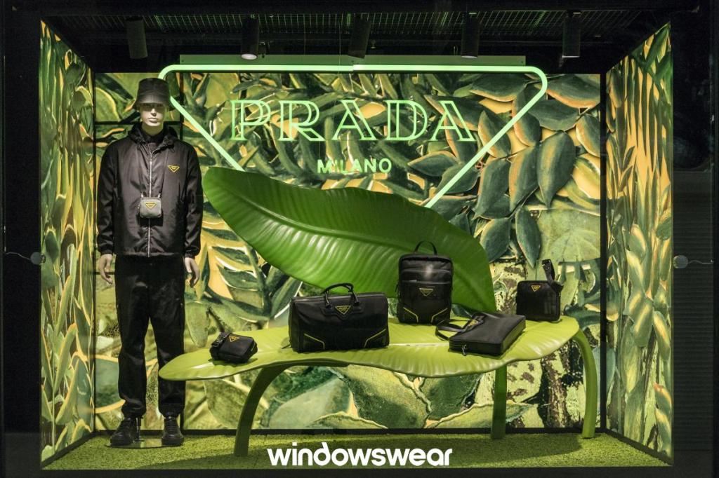
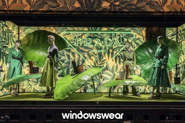
Prada created an aesthetically pleasing display that gives customers a Spring and sustainable vibe! Notice how there are multiple different types of items being displayed to encourage customers to buy a set of items instead of just one. This is a genius skill to use when marketing products because it makes customers want to buy multiple items at a time. Prada used color, texture and tension as tools in this display. The color green throughout the window display creates a fresh and sustainable feel and appeals well to the viewers eyes. There is some texture and tension created with the use of giant leaves as they appear to be tilted but are still able to support the accessories that they are holding. Overall, this display highlights their products very well and and it all comes together to create a unified whole!
Moschino February Display in New York
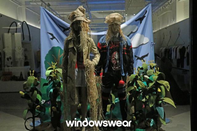
It appears as if Moschino was attempting to create a sustainable display with the use of natural looking materials. Sustainability has been a popular topic and has become a concern for consumers when they purchase products. Customers are starting to care about what fibers are used to make their clothing and whether they were ethically made or not. It is smart for companies to voice that they care about the impact that they make on the environment through displays. However, this window appears to be incomplete and unbalanced. The backdrop looks like it is unstable and hidden from all of the other merchandise which creates tension, but not in a visually pleasing way. It seems as if the backdrop may topple over at any moment which causes viewers to be nervous or uncomfortable while viewing the display. This type of tension may distract the customer from viewing the merchandise that is being presented to them. Their clothing looks very fun and savvy, but it is hard to notice that aspect with everything else that is going on in this window. It would be nice if there was more of a sequence in which items are presented for viewing to consumers. I would recommend Moschino to decrease the amount of props used in their display and to space everything out more to create a unified whole.
