Jo Malone March Display 2020
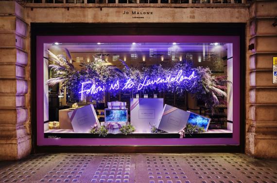
Jo Malone launches new fragrance in London and their window display is beaming with Neon, technology, and beauty! This window display includes proper communication through signage before even entering the store. This bright and attractive sign draws attention to customers and reveals the new lavender scented fragrance. This display communicates Jo Malone’s upscale brand image by using digital screens to display merchandise, neon lighting for signage, savvy gift boxes for packaging, and a huge lavender cloud to bring it all together. The tone-of-voice in the signage is very polite as the company chose to use a lowercase and elegant font making it easy for customers to read the message. Overall this display is wonderful and Jo Malone really knows how to present signage effectively in their window displays!
Penhaligon’s March Display 2020
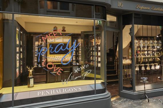
Penhaligon’s is an upscale fragrance and beauty shop and their March display focuses on signage and has a simplistic design with few items being displayed in the window. Personally, I was not visually pleased by their signage in this display. The color of the wording does not seem to go with the store atmosphere. It is quite confusing to see three different colors used for front all in one place as well. Additionally, there are multiple types of fonts used all in one spot . It is important to stay consistent when creating signage, especially for a window display that can be viewed from outside of the shop. With consistent font color and wording, it can be less confusing to interpret the overall message of the sign. I would like to compliment Penahaligon’s on using William P’s handwritten name printed on the window as a signature. This is where a change in font would be more acceptable. By using William’s handwritten name in print, it communicates a tone of exclusivity and convinces the customer that the merchandise is unique to the company and their customers too.
