Micael Kors Display

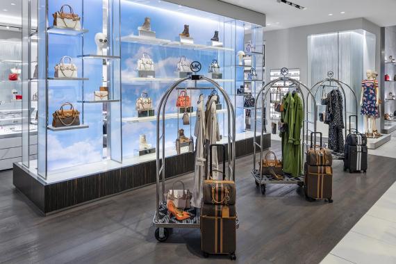
Michael Kors February display in London symbolizes the luxury of travel and accessories. The window display is set to be on an airplane with a gorgeous view of the sky and what is better than traveling to somewhere new with your favorite handbag?! The display comes together as a unified whole all around and even the interior of the store goes with the theme of traveling by adding a cloud backdrop near the accessories and luggage carts to display merchandise. I absolutely love this layout and would be intrigued to purchase a new item for travel after being drawn in to the store. This display is truly inspirational and shows that the options are endless when it comes to creating a window display and floor layout.
Burberry Display
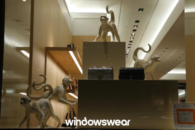
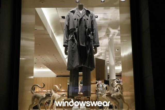
I found this Burberry display to be a bit displeasing because it is lacking a theme and causes a bit of negative tension. The first thing that I noticed when viewing this display is the monkeys and I could not pin point why they were there because there was nothing else around them to represent a theme. The monkeys are bigger than the accessories being displayed which I feel is taking attention away from what is being sold. The garments displayed on the mannequin look very trendy and slick, but I am afraid the merchandise is being underrepresented in this display because there is not a lot of design elements used to catch the viewers eye.
