Bloomingdales February Display
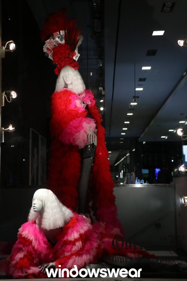
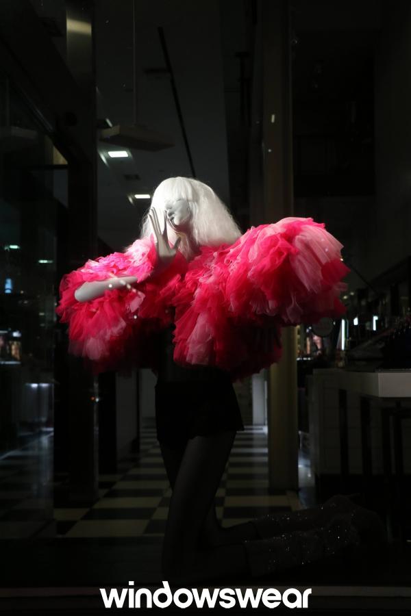
Bloomingdales February display is clearly inspired by Valentines Day and is encouraging consumers to go in and buy sexy and elegant lingerie for their special someone. I really enjoy the use of spotlight lighting in this display. It really brings out the bright and cheery colors on the models and allows the viewer to focus on the merchandise. Bloomingdales used color as a primary design element by using different tints and shades of red combined to create an aesthetically pleasing ensemble. The texture of the lingerie makes me want to walk right into the store and get a feel of the merchandise myself! The direction and sequence of the models are placed in a way where you can easily view the items in a presented order. I love how the models seem to be in motion and show movement, it makes the display feel more realistic. This is an outstanding display!
Gucci February Display
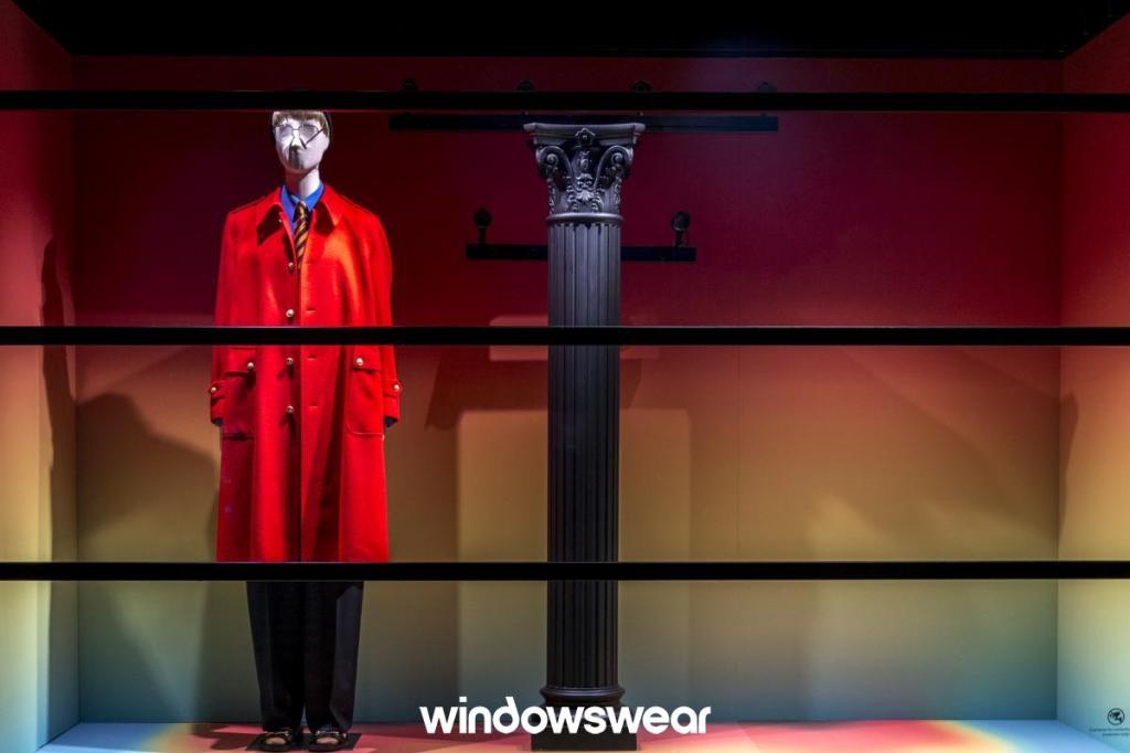
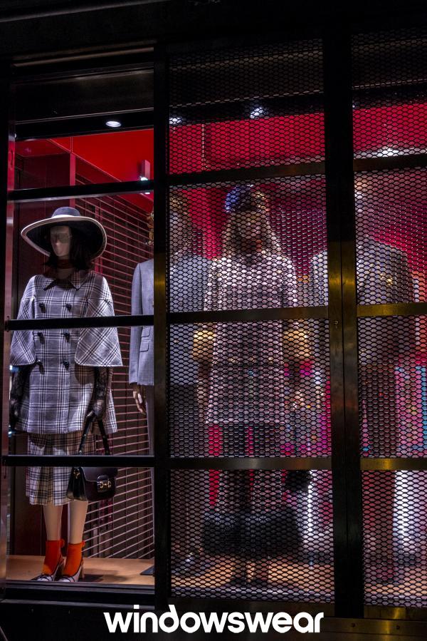
As a fashion professional, and from my perspective, Gucci’s February display shows graceful and elegant spring outerwear merchandise and is put together in a unique way. However, a typical consumer may not appreciate or fully understand the set up of this display which may result in some confusion and negative reviews. Gucci used positive and negative space which is a very hard design element to achieve successfully. Some viewers may feel as if there is not enough being displayed in the first image above and may be expecting more in a display from this luxury brand. However, I am here to teach you that Gucci did this on purpose. They purposely created a tension of imbalance in this window to make viewers wonder about they layout of the display which leaves more of a memorable impression. I would have liked for Gucci to exclude the gated window fencing in image two because it is taking away the ability to be able to view construction details of the garments. It would be more visually pleasing had the whole window been visible like the left side of the image. Gucci’s February display did exactly what it wanted to do to it’s viewers which was to create tension so that we could wonder why it is that way.

